.note, .store, and .download
A paragraph block with a thin border line.
Usage
[Download](download) it from GitHub
{: .download}

Love this plugin? please consider [buying me a cup of coffee](donate).
{: .store}
Example
Download it from GitHub
Love this plugin? please consider buying me a cup of coffee.
.largetype
Make normal paragraph text large enough.
Usage
[PayPal](donate)
{: .largetype}
Example
.browser
A simple browser frame using pure CSS.
Usage

{: .browser}
Example
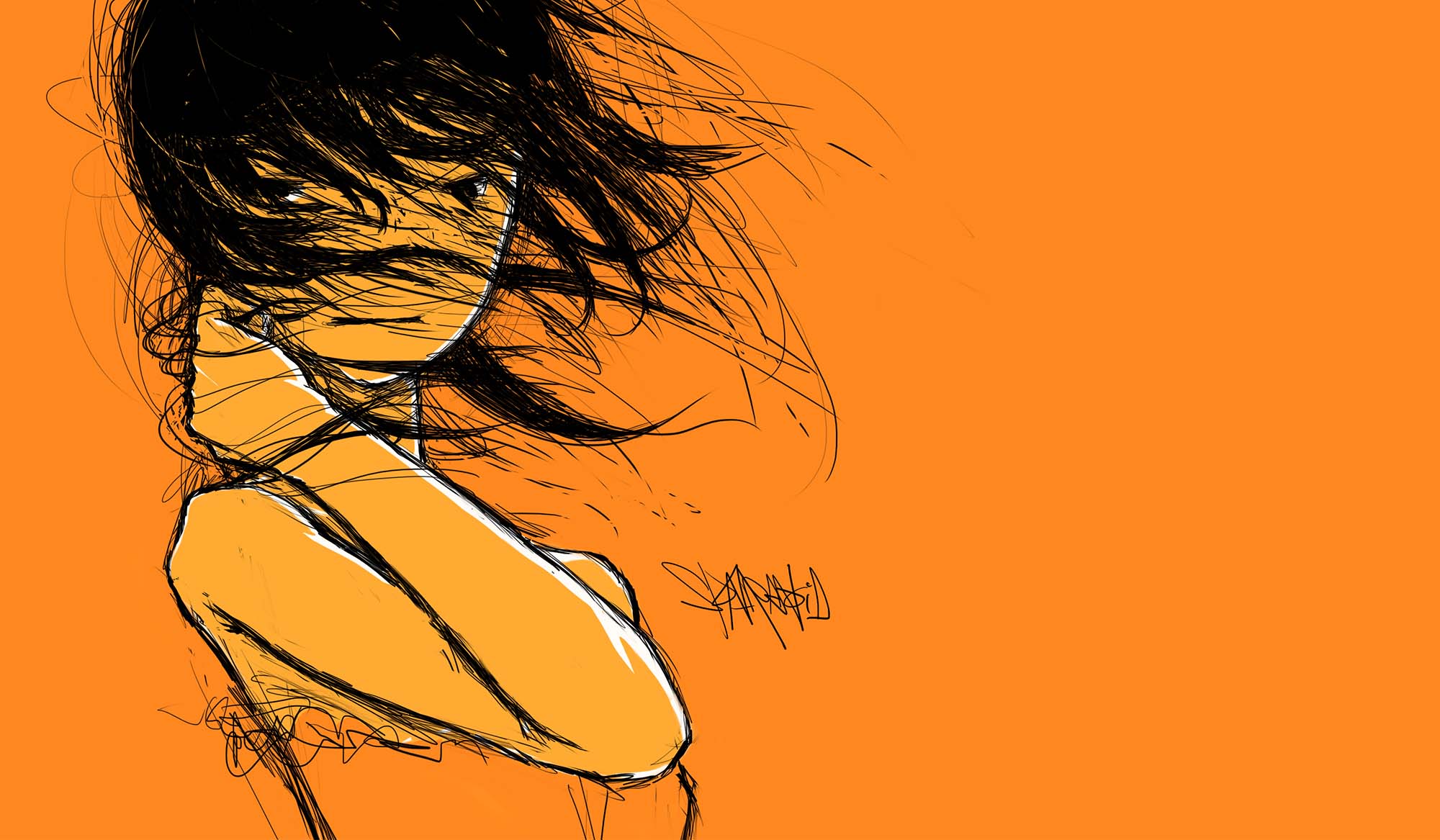
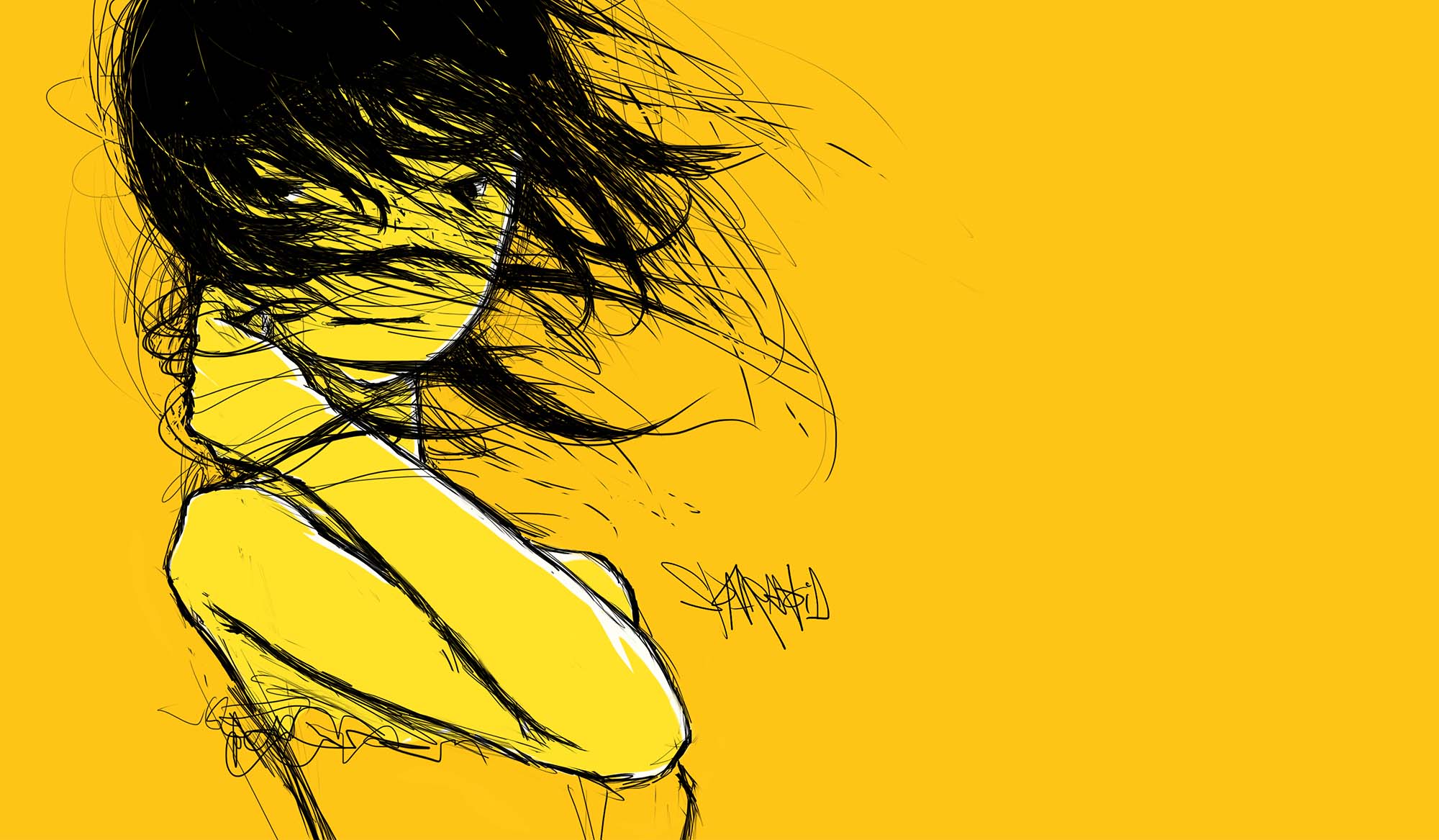
Lightense Images
A simple library inspired by Tim Holman to view large images up close using simple mouse interaction, and the full screen.
Usage
Add the following setting to your post front-matter field:
plugin: lightense
Markdown markup:

Lightense Images is activated globally by default, if you want to disable this effect for specific image, you can simply apply .no-lightense CSS class to your image or <img>:
{: .no-lightense}
Please note that if you’re using HTML markup, you should wrap your images into a <p> container.
Example
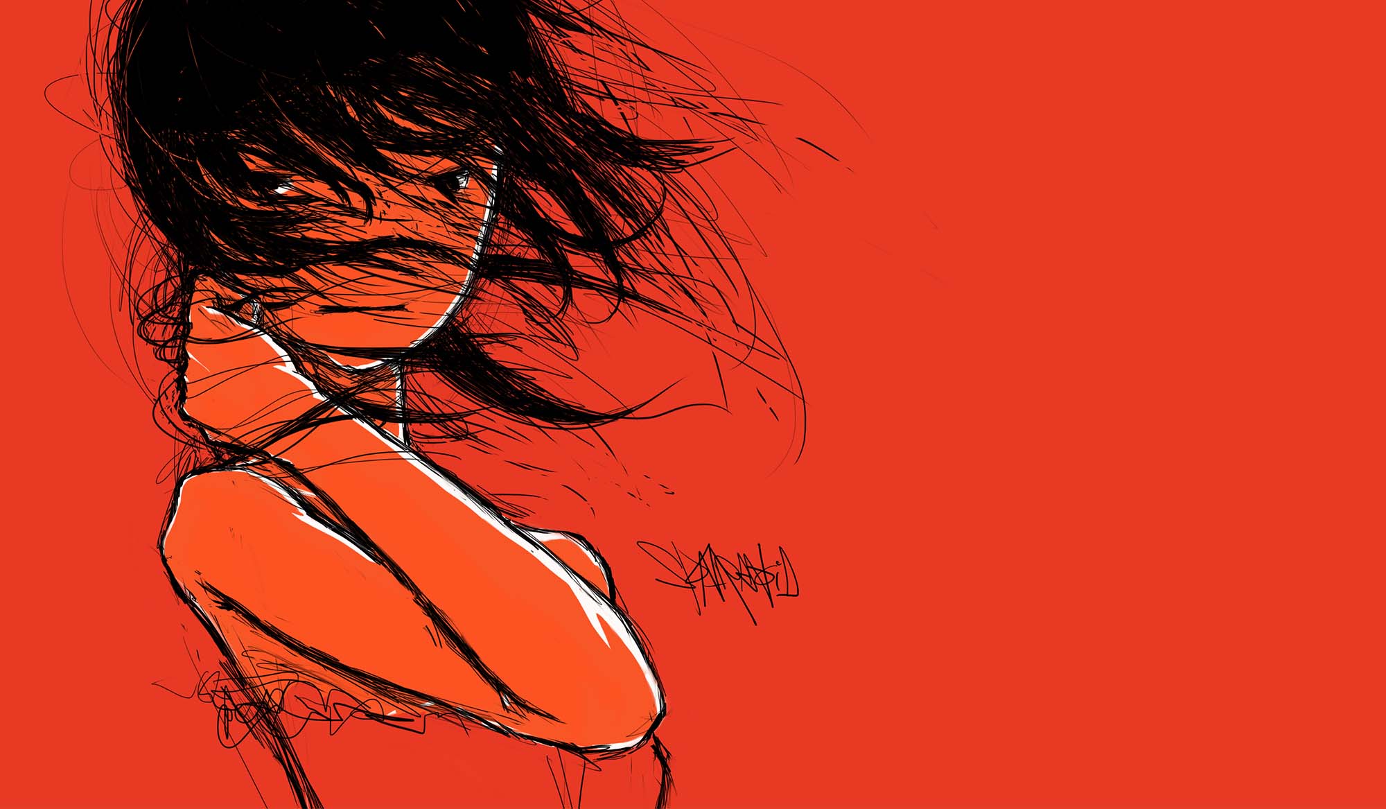
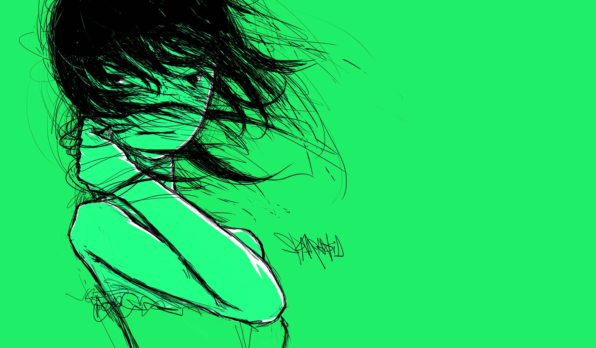
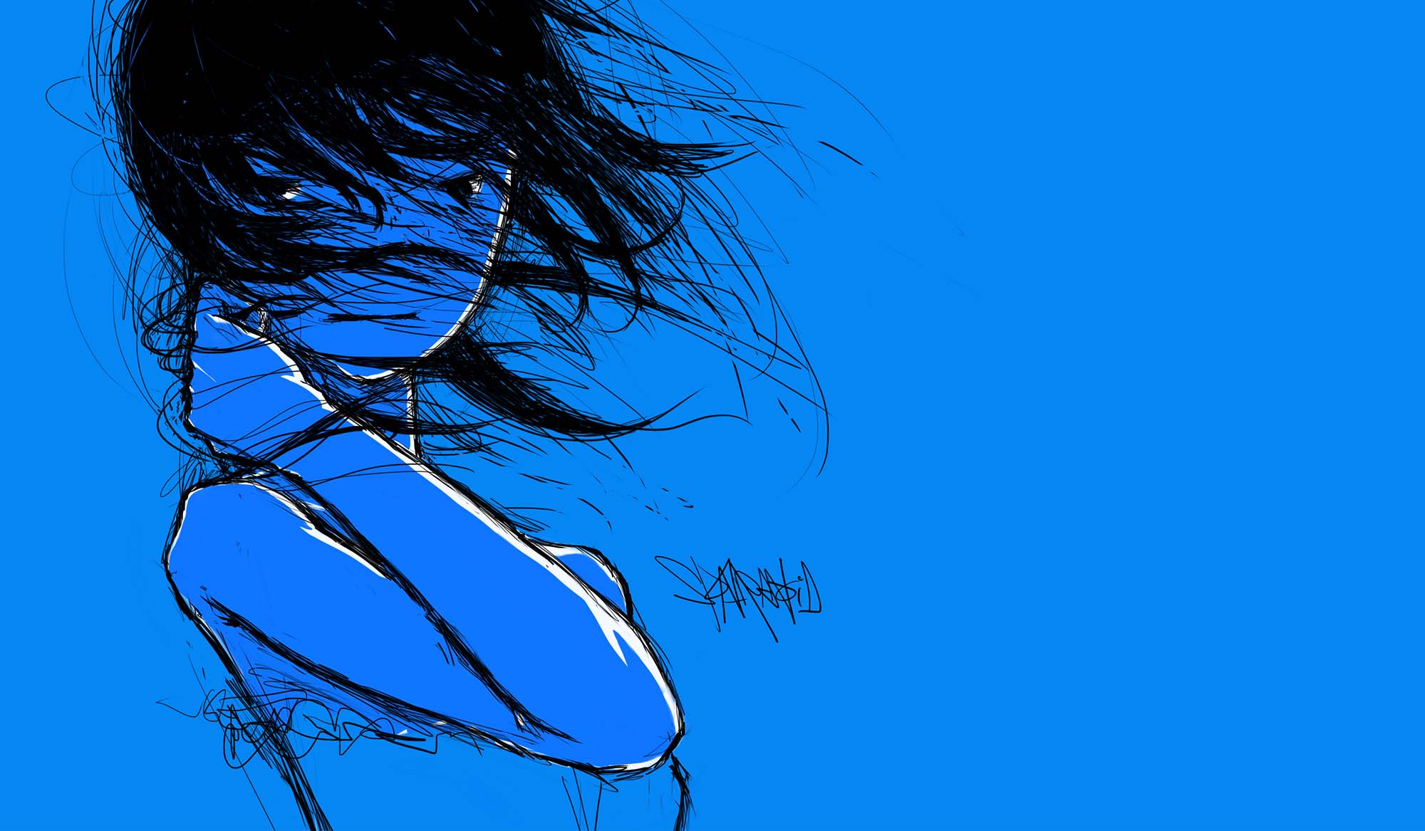
Image Sizes
There’re different size helpers for images. They’re available using the following CSS classes:
Small Size
{: .size-small}
Medium Size
The medium size is the default size of images, so you don’t need additional CSS classes for it.

Large Size
{: .size-large}
Aligned Images
{: .size-left}
{: .size-right}
Aligned images are smaller images beside the text, you can just apply .size-left or .size-right to your images and nothing special markup required. However, that aligned images will be responded to normal large size for small desktops or mobile devices.
Small Images
Useful for images smaller than container width.
{: .no-resize}

Small Images (center)
{: .no-resize.center}